
How To Write Reusable React Components
Reactjs is an open-source, front-end, a javascript library for building UI components. Recently, it has gained popularity due to its growing community, simplicity, and flexibility. It allows developers to decompose complex UI into reusable components.
Writing reusable components is very key in React and it comes with a lot of advantages which includes:
- Less code which in turn saves you a lot of time.
- Faster development.
- It makes code maintenance easier.
- It simplifies the codebase. etc.
In this article, you would be learning how to create a reusable React component or how to optimize an existing component. But before then, I would assume that the reader is familiar with React and everything related to it. Depending on the following assumptions below; you can continue reading.
- You are familiar with React hooks
- You are familiar with react hook form dependency for form validation
- You already have a sample React project running.
- You are familiar with the Es6 arrow function
- You are familiar with the Material-UI package and you have it installed.
- You are familiar with Redux and you have it installed
This will be practical-based learning and we are going to be working on a login page. We will start by creating a traditional react component that encompasses the view and logic and then, we will move on to separating concerns i.e separating logic from the view just to ensure reusability.
First, let’s traditionally create our login component having the logic and view in the same component.
import Typography from '@material-ui/core/Typography';
import Container from '@material-ui/core/Container';
import React, {  useState } from 'react'
import Avatar from '@material-ui/core/Avatar';
import Button from '@material-ui/core/Button';
import TextField from '@material-ui/core/TextField';
import LockOutlinedIcon from '@material-ui/icons/LockOutlined';
import Typography from '@material-ui/core/Typography';
import { makeStyles } from '@material-ui/core/styles';


const useStyles = makeStyles((theme) => ({
    paper: {
        backgroundColor: theme.palette.background.paper,
        marginTop: theme.spacing(12),
        display: 'flex',
        flexDirection: 'column',
        alignItems: 'center',
        padding: theme.spacing(2, 3, 3),
    },
    avatar: {
        margin: theme.spacing(1),
        backgroundColor: theme.palette.secondary.main,
    },
    form: {
        width: '100%', // Fix IE 11 issue.
        marginTop: theme.spacing(1),
    },
    submit: {
        margin: theme.spacing(3, 0, 2),
    },
}));


const  Login = () => {
    const classes = useStyles();
    const [email, setEmail] = useState(null)
    const [password, setPassword] = useState(null)

    const handleSubmit = async () => {
        // do some validation and
        // dispatch an action
    };

    return (
        <Container component="main" maxWidth="xs">
            <div className={classes.paper}>
                <Avatar className={classes.avatar}>
                    <LockOutlinedIcon />
                </Avatar>
                <Typography component="h1" variant="h5">
                    Login
                </Typography>
                <form className={classes.form} noValidate>
                    <TextField
                        variant="outlined"
                        margin="normal"
                        required
                        fullWidth
                        id="email"
                        label="Email Address"
                        name="email"
                        autoComplete="email"
                        autoFocus
                        value={email}
                        onChange={(e) => setEmail(e.target.value)}
                    />
                    <TextField
                        variant="outlined"
                        margin="normal"
                        required
                        fullWidth
                        name="password"
                        label="Password"
                        type="password"
                        id="password"
                        value={password}
                        onChange={(e) =>setPassword(e.target.value)}
                    />
                    <Button
                        fullWidth
                        variant="contained"
                        color="primary"
                        className={classes.submit}
                        disableRipple={true}
                        onClick={handleSubmit}
                    >
                        Log In
                    </Button>

                </form>
            </div>

        </Container>
    );
}
This login component created above is nice and will work fine but the logic is tightly coupled to the view and can only be used inside the login component alone, hence it's not reusable. Let's take a step backward and try to refactor the code in the login component.
The first thing you need to always ensure is to always separate the component logic from the view. So, we will start by creating our login view. Let’s call it LoginView.js.
import Avatar from '@material-ui/core/Avatar';
import Button from '@material-ui/core/Button';
import TextField from '@material-ui/core/TextField';
import LockOutlinedIcon from '@material-ui/icons/LockOutlined';
import Typography from '@material-ui/core/Typography';
import { makeStyles } from '@material-ui/core/styles';
const useStyles = makeStyles((theme) => ({
paper: {
backgroundColor: theme.palette.background.paper,
marginTop: theme.spacing(12),
display: 'flex',
flexDirection: 'column',
alignItems: 'center',
padding: theme.spacing(2, 3, 3),
},
avatar: {
margin: theme.spacing(1),
backgroundColor: theme.palette.secondary.main,
},
form: {
width: '100%', // Fix IE 11 issue.
marginTop: theme.spacing(1),
},
submit: {
margin: theme.spacing(3, 0, 2),
},
}));
const LoginView = () => {
const classes = useStyles();
return (
<div className={classes.paper}>
<Avatar className={classes.avatar}>
<LockOutlinedIcon />
</Avatar>
<Typography component="h1" variant="h5">
Login
</Typography>
<form className={classes.form} noValidate>
<TextField
variant="outlined"
margin="normal"
required
fullWidth
id="email"
label="Email Address"
name="email"
autoComplete="email"
autoFocus
/>
<TextField
variant="outlined"
margin="normal"
required
fullWidth
name="password"
label="Password"
type="password"
id="password"
/>
<Button
fullWidth
variant="contained"
color="primary"
className={classes.submit}
disableRipple={true}
>
Sign In
</Button>
</form>
</div>
);
}
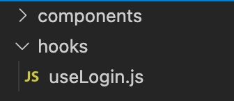
export default LoginViewNext is to create a hook to handle the logic, let's create a folder called hooks and we create a useLogin.js file inside it. Our folder structure should look like this now
Then, let's write the logic for the LoginView.
import{useReducer } from 'react';
import { useDispatch } from 'react-redux';


const initialState = {
    email: '',
    password: '',
};

const reducer = (state, action) =>  {
    return {
        ...state,
       [action.type]: action.payload
    };
}

const useLogin = () =>  {
    const dispatch = useDispatch();

    const [state, onFormInputChange] = useReducer(reducer, initialState);
    const { email, password} = state;

    const handleChange = event => onFormInputChange({ type: event.target.id, payload: event.target.value.trim() })

    const handleSubmit = async ({email ,password}) => {
        //validate form field
        //dispatch an action
    };

    return {
        email,
        password,
        handleChange,
        handleSubmit,
    }
}

export default useLogin
To further explain what was done above in simple terms; The initial state, the function (handleChange) to handle the form fields change, and the function to handle the form submission were declared and exported for external use.
The next thing to work on is to refactor the LoginView component to integrate the useLogin function
The next thing to work on is to refactor the LoginView component to integrate the useLogin function.
import Avatar from '@material-ui/core/Avatar';
import Button from '@material-ui/core/Button';
import TextField from '@material-ui/core/TextField';
import Grid from '@material-ui/core/Grid';
import LockOutlinedIcon from '@material-ui/icons/LockOutlined';
import Typography from '@material-ui/core/Typography';
import { makeStyles } from '@material-ui/core/styles';


const useStyles = makeStyles((theme) => ({
  paper: {
    backgroundColor: theme.palette.background.paper,
    marginTop: theme.spacing(12),
    display: 'flex',
    flexDirection: 'column',
    alignItems: 'center',
    padding: theme.spacing(2, 3, 3),
  },
  avatar: {
    margin: theme.spacing(1),
    backgroundColor: theme.palette.secondary.main,
  },
  form: {
    width: '100%', // Fix IE 11 issue.
    marginTop: theme.spacing(1),
  },
  submit: {
    margin: theme.spacing(3, 0, 2),
  },
}));


const LoginForm = ({
    email,
    password,
    handleChange,
    handleSubmit,
  }) => {
    const classes = useStyles();
    return (
      <div className={classes.paper}>
        <Avatar className={classes.avatar}>
          <LockOutlinedIcon />
        </Avatar>
        <Typography component="h1" variant="h5">
          Login
        </Typography>
        <form className={classes.form} noValidate>
          <TextField
            variant="outlined"
            margin="normal"
            required
            fullWidth
            id="email"
            label="Email Address"
            name="email"
            autoComplete="email"
            autoFocus
            value={email}
            onChange={handleChange}
          />
          <TextField
            variant="outlined"
            margin="normal"
            required
            fullWidth
            name="password"
            label="Password"
            type="password"
            id="password"
            value={password}
            onChange={handleChange}
          />
          <Button
            fullWidth
            variant="contained"
            color="primary"
            className={classes.submit}
            disableRipple={true}
            onClick={()=>handleSubmit({ email, password})}
          >
            Sign In
          </Button>

        </form>
      </div>
  );
}

export default LoginForm
The whole thing is looking good already. To finish the whole process let's go back to our Login.js file to make the final changes.
The Login.js file now looks like
import Container from '@material-ui/core/Container';
import LoginView from  "./components/Auth/LoginView";
import useLogin from './hooks/useLogin';
import React from 'react'


const Login = () => {

  return (
    <Container component="main" maxWidth="xs">
      <LoginView {...useLogin()}/>
    </Container>
  );
}

export default Login
Apparently, what we did here was to use the LoginView component we created and to destructure object being returned from the useLogin function when called which then serve as props to the Login View.
Conclusion
We have seen how separating logic from views has made components reusability so easy to come by. As a good practice, always ensure you separate your logic from your view.
If you think this is helpful to you, don’t hesitate to clap for me.


